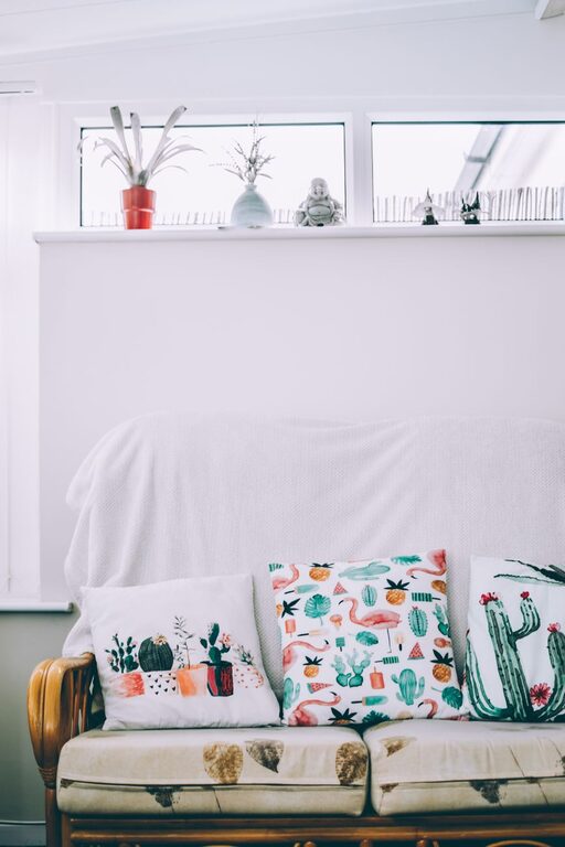

Creating a peaceful and relaxing home environment often starts with the colors you choose for your walls and furnishings. Calm colors have the power to soothe your mind, reduce stress, and make your living space inviting. If you’re thinking about refreshing a room or your entire home, selecting the right calm colors is essential. This guide offers helpful tips to choose colors that bring balance and tranquility to your space.
Why Choose Calm Colors?
Calm colors, often soft hues and neutral shades, encourage a sense of serenity. Unlike bold and bright tones, calm colors don’t overwhelm your senses—they invite relaxation and comfort. Whether you want to transform your bedroom into a restful retreat or create a tranquil living room for family gatherings, calm colors can set the perfect mood.
Common calm colors include soft blues, gentle greens, warm beiges, gentle grays, and muted pastels. These colors naturally mimic elements in nature, like the sky, ocean, and foliage, which is why they feel so soothing.
Tips for Choosing Calm Colors for Your Home
1. Consider the Mood of Each Room
Different rooms have different purposes, so think about how you want to feel in each space.
– Bedroom: Aim for colors that promote restfulness, such as soft blues, lavender, or pale greens.
– Living room: Create a welcoming atmosphere with warm neutrals like beige or light taupe, paired with gentle accent colors.
– Bathroom: Use fresh and clean colors like light aqua or soft gray for a refreshing feel.
– Home office: Choose colors that help with focus and calmness, such as muted greens or soft blues.
Understanding the mood you want will guide your color choices effectively.
2. Use Neutral Colors as a Base
Neutral colors like whites, creams, grays, and light browns are excellent bases for calm interiors. They provide a flexible backdrop that works well with other calm colors and can make a room feel larger and brighter.
Consider pairing a neutral wall color with soft-colored furniture or accents to add subtle depth without overwhelming the senses.
3. Stick to Soft, Muted Shades
Avoid colors that are too bright or saturated if you want a calm ambiance. Instead, select muted tones that have a gray or brown undertone. These shades are less intense and more soothing.
For example:
– Instead of bright yellow, opt for a pastel or buttery yellow.
– Instead of vibrant green, choose sage or olive.
– Instead of stark white, try warm white or ivory.
4. Test Colors in Different Lighting
Lighting can dramatically affect how a color looks in your home. Natural light, artificial bulbs, and room orientation all play a role.
Before committing:
– Paint small test patches on your walls.
– Observe the colors at different times of day.
– Notice how artificial lighting changes the color in the evening.
This process helps avoid surprises and ensures the chosen color maintains its calm effect in all lighting conditions.
5. Balance Warm and Cool Tones
Both warm and cool calm colors can work beautifully, but balancing them creates a harmonious space.
– Warm tones (like soft peach, warm beige, or muted coral) make rooms feel cozy.
– Cool tones (like pale blue, soft gray, or lavender) create a crisp and airy feeling.
Mixing these tones through paint, textiles, or decor can prevent the room from feeling too cold or too heavy.
6. Use Accent Colors Sparingly
To keep a calm atmosphere, limit the number of colors and use accent colors in small amounts.
Accent colors should complement the main palette without overwhelming it. Examples include:
– Light blush or dusty rose pillows in a gray living room.
– Soft mint green accessories in a beige bedroom.
– Powder blue curtains in a cream-colored space.
7. Incorporate Natural Materials and Textures
Colors are just one aspect of creating calmness. Natural materials like wood, cotton, linen, and stone paired with calm colors enhance the soothing effect.
Textures soften a space and add interest without introducing loud colors. Think wooden furniture, woven rugs, and linen cushions in your chosen calm color palette.
8. Keep It Simple and Consistent
Too many colors and patterns can disrupt calmness. Stick to a simple, consistent palette throughout a room or even your whole home to keep the space feeling peaceful.
Choose two or three main calm colors and a few coordinating neutrals for a cohesive look.
Popular Calm Color Palettes to Consider
– Soft Blue + Warm Beige + White: A classic coastal-inspired palette that feels fresh and relaxing.
– Sage Green + Light Gray + Cream: A perfect blend of earthy and neutral tones for a grounded feel.
– Lavender + Pale Gray + Blush: Subtle and elegant, great for bedrooms or bathrooms.
– Muted Taupe + Soft White + Dusty Rose: Warm and inviting with a touch of gentle color.
Final Thoughts
Choosing calm colors can significantly impact your home’s atmosphere. By focusing on soft, muted tones, considering each room’s function, testing colors under different lights, and keeping accents minimal, you can create a serene and inviting environment.
Remember, calm doesn’t mean boring. With thoughtful color choices and the right textures, your home can feel both peaceful and stylish—a comforting haven for you and your family. Happy decorating!